Thursday, May 27, 2010

Album Covers with Naked Boobies

Sometimes it's fun just to revert to your fourteen-year-old self...

Back when people cared about 'the album' (ask your parents), they also cared about the album cover. Some album covers were awesome, some were horrible. Some had dirty pictures on them... that's what matters here. Fifteen albums with boobies on the cover. Yay!

Note: to keep this 'SFW', I'm only linking the cover image. Mr. Blogspot, I hope you appreciate it...

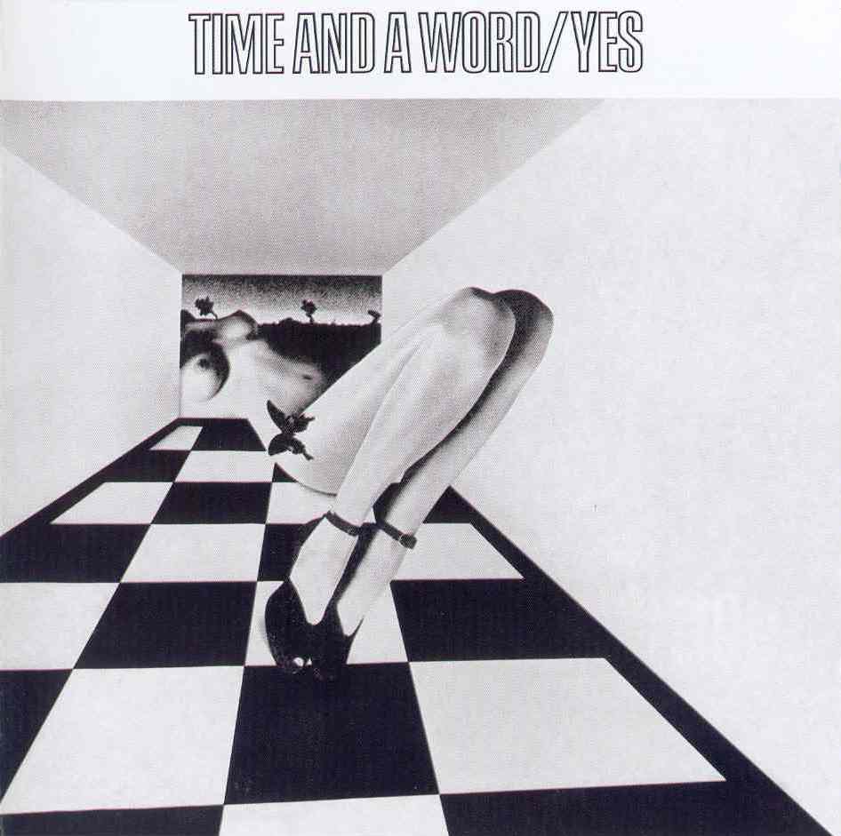
1. "Time and a Word" by Yes: It was actually seeing this one in a CD shop the other day that got me all adolescent again. It's not exactly a sexy cover; what it is is a weird one, with a giant woman sticking her legs into a checkerboard room. She's wearing shoes and a butterfly. She's a drawing, mind you, but still: boobies all the same.

2. "Abraxas" by Santana: An album cover that certainly piqued the fantasies of any straight teenage boy who ever laid eyes on it. There was a time when Santana's stock in trade was the 'exotic', and God knows it doesn't get more exotic that this: a nude black woman with a dove protecting her modesty gazes at a nude red-and-purple woman with wings. There's all kinds of weirdness going on, and the whole thing would be freaky if it weren't for the fact that the two women are undeniably sexy.

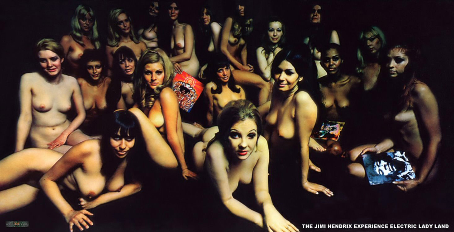
3. "Electric Ladyland" by the Jimi Hendrix Experience: A famous one, this. Apparently Jimi Hendrix hated this cover, preferring the one that's yellow and red and of his face. It's fine, but an ocean of naked laydees, many of which are holding Jimi Hendrix album covers, is way, way better if you're a teenaged boy.

4. "Blind Faith" by Blind Faith: It gets weirder now. This 'supergroup', featuring Steve Winwood and Eric Clapton, recorded only one album together. Looking for a little controversy, I guess, they went ahead and produced this album, featuring a pubescent girl, topless and holding a metal airplane. Why? I have no idea. I was quite shocked when I saw this album cover for the first time - when I was perhaps her age (well, the age she would have been at the time), maybe 12 or 13. I was shocked, because that's something you never see: any younger than that, and it's fine (because they're kids). A few years older than that, and it's fine, too (because they're adults). But this netherworld between childhood and adulthood tends to be completely off-limits, since it's the realm of the sexual predator. Or the supergroup, I guess.

5. "Country Life" by Roxy Music: Strictly speaking, this falls out of the bounds of the description: one of the two women here is wearing a hand-bra, the other a proper bra. But that second one really might as well not be, as the bras in Sears Catalogues never quite looked like that... And of course, there's what's going on down below the waist, where both are wearing panties that could properly be defined as 'scanty', and the one with the proper bra thus has her hands free to... well, I'm not sure how many other albums of the era split their time between the den next to the record player and in the bathroom, behind a locked door.

6. "In Trance" by the Scorpions: Masters of the controversial album cover, the Scorpions have put out several covers that might have appeared in this list. In one case, of course, the Scorpions have an album cover so controversial that the British government actually banned the Wikipedia page devoted to it. This, the band's third album, is a rather more innocent fare. Nudity, yes, but nothing offensive. It's actually, by the Scorpions' standards, tasteful. And there's a no-nipple version available too (actually every album I've mentioned so far except "Abraxas" has a bowlderised version).

7. "Indelibly Stamped" by Supertramp: Some people find tattoos sexy. or rather, I should say that some tattoos are sexy. Yet this cover is perhaps the least attractive one on the list, bar perhaps the pre-teen on "Blind Faith". If it weren't for the very obvious fact that those are female breasts, I'd guess this was a man.

8. "Expensive Shit" by Fela Kuti: This is a really gorgeous cover, all the nicer for being exotic. Fela was a Nigerian folk hero, who constantly fought with the ruling government. The title track describes one such run-in with the junta, and though I don't know the whole story, a group of topless young ladies flashing the power salute behind rows of barbed wire just looks like sedition itself, whatever it describes.

9. "Weapons" by Rough Trade: One from my own personal childhood, as a Canadian child-of-the-eighties. It's not just the front cover: the back cover and inner sleeve are just as saturated with skin, wet and tanned. With body parts cropped up, genders mixed and matched, and both sexes showing equal muscle tone, it was a statement, even as it was equally good old-fashioned titillation.

10. "Surfer Rosa" by the Pixies: This album surprised me, because the Pixies were American, and as far as I knew, boobies were verboten in the USA. But then again, their label, 4AD, was British. It was a great cover: mysterious, Latin American, antiquated... it had nothing to do with the Pixies, and yet somehow everything to do with the Pixies.

11. "The Dwarves are Young and Good Looking" by the Dwarves: Almost every Dwarves album has naked women on the cover. I've chosen by far the tamest one: this is merely breasts, a ski mask and a skateboard. Other Dwarves albums have featured, in addition to full frontal nudity, blood, crucifixion, and a dwarf. They all tend to have a dwarf.

12. "Drinkin', Lechin' and Lyin'" by Boss Hogg: While this also goes against the article's M.O. a bit by featuring full frontal nudity (yes, 'down there' too), this get some kind of guts award, because the incredibly in-your-face cover actually features a band member, Cristina Martinez, singer and girlfriend of band leader Jon Spencer. Quite impressive, methinks,

13. "Pure" by the Golden Palominos: If booby is what you want, booby is what you'll get... all this cover is is a giant breast, tinted red and so huge that it's almost desexualised. Almost.
 
14. "Simple Pleasure" by Tindersticks: Speaking of desexualised, somehow the frank nudity of this album cover still manages to not be sexy. I'm not sure what it is - perhaps it's the woman's rather more 'natural' body. Perhaps she's pregnant.

15. "For the Beauty of Wynona" by Daniel Lanois: An interesting one, here. Like the one before it, more cinema vérité than cheesecake, the woman is not especially attractive: this ime for being rake thin. Yet the cover, mysterious with its dark, muted colours and knife, is really quite beautiful. And in one last affront, in the United States has the words "American Edition" plastered over the cover just so to cover over Wynona's nipples...

And if fifteen's not enough, here's fifteen more, in "part two".
Enhanced by Zemanta

Thursday, May 20, 2010

Hit-Point Sexuality

Kiss In (31) - 14Feb10, Paris (France)Image by philippe leroyer via Flickr
I once asked an online forum whether, in their opinion, a bisexual person could be best described as 'both gay and straight' or 'neither gay nor straight'. The vast, vast majority of respondents said the latter: that it was a third-way, something seperate from either extreme.

I felt a bit disappointed with the response, and just the other day, thinking about it in retrospect, I think the reason was this: in order to see bisexuality as 'neither of the others', you have to define sexuality in terms of who people aren't attracted to. And it seems a bit strange to me to define 'gay' as 'not attracted to the opposite sex' - while that might be true in general terms of gay people, it doesn't strike me as the defining factor of homosexuality. So, if you look only in the positive sense - namely that sexualities are defined by who people are attracted to, then the logic that 'bisexual' = 'attracted to the opposite sex' + 'attracted to the same sex' seems unavoidable. To put it differently, "bisexuality" is defined as "+gay" and "+straight", where "gay" means "attracted to the same sex" and "straight" means "attracted to the opposite sex". "Asexuality" could thus be defined as "-gay" and "-straight".

It might not even matter, if you subscribe to the theory that all people are essentially bisexual: that, as opposed to a duality, or division into three or however many parts you'd like, that sexuality exists on a spectrum, ranging from exclusive heterosexuality at one extreme to exclusive homosexuality at the other. Certainly the Kinsey Institute proposes such a range, and its voice is influential.

I agree with it, to a certain extent: even adding a second dimension that could incorporate asexuality in degrees, like those panels of colour that paint programmes bring up when you want to choose a hue: containing a full spectrum from left to right, but softening down to the same white across the board as you get to the bottom. I think it gives an idea of human sexuality as much more complex than mere labels.

But I think I realised the one thing I didn't really like about the spectrum approach to sexuality, and namely it's this: I have a gay friend who can, in degrees, admit to liking certain things about the opposite sex. While that certainly fits in with the idea that everyone is a certain degree of bisexual, in this particular case it seemed strange that admitting what might be described as 'slight heterosexuality' in some way made her 'less gay' than someone who wouldn't make such an admission. While that second person's needle would be at the limit of the meter, hers would be a bit more inclined to the middle. It seemed like, if you'll pardon the crudeness of the comparison, a heavy metal fan who also liked some country was in some way less of a metalhead than someone whose CD collection consisted entirely of acts in black leather.

So then I got to thinking of those games I never played when I was a kid: Dungeons and Dragons, or those card games where people seem to collect all kinds of different characters and have them fight each other. Or perhaps fantasy video games, too. Anyway, I'm picturing the kind of game where characters have statistics like 'stamina', 'strength' and 'charisma', and numbers attached to them. They're parameters, you could say, and by looking at them all in full do you get a sense of that particular character's strengths and weaknesses.

What if human sexuality, instead of individual boxes or even a cline by degrees, was seen in terms of such a checklist? One exclusively heterosexual person might be "Heterosexuality: 10, Homosexuality: 0", whereas a fundamentally heterosexual person who might find some appeal in same-sex relationships might, for example, be "Heterosexuality:10, Homosexuality: 2". In other words, the existence of some homosexual urges don't in any way negate or diminish the person's essential heterosexuality. In other words, the second person isn't in any way 'less heterosexual' than the first; if anything, they're 'heterosexual plus'. And where perhaps this person would be a candidate for the term 'bisexual', there's a good chance that this person would reject that label and feel most comfortable identifying as straight. An asexual person with slight gay tendencies might, perhaps, be "Heterosexuality: 0, Homosexuality: 2".

It would be silly for people to identify their sexualities with a scorecard. But I think the tendency to break things down to simplified absolutes denies us the full range of human sexual responses that exist out there, and making hundreds of tinier and tinier labels is of little use either (to that end, I should say that my card of stats should probably read 'male-attraction' and 'female-attraction', as opposed to 'heterosexuality' and 'homosexuality' so as not to exclude transgendered, two-spirited or gender-ambiguous people).
Reblog this post [with Zemanta]

Tuesday, May 18, 2010

This old man

Depiction of a wino or town drunkImage via Wikipedia
So I got to thinking about the old man who went to bed and bumped his head and couldn't get up in the morning.

Then I got to wondering if he was the same old man who, with a knick-knack paddy-whack give-the-dog-a-bone, came rolling home.

And if so, perhaps he's just a chronic alcoholic?

Reblog this post [with Zemanta]

Saturday, May 15, 2010

The Mysterious Case of Elvis Presley's Album Covers

There are a few salient points that everyone knows about Elvis in the 1970s: (1) He performed live a lot, usually in Las Vegas. (2) He tended to perform in white rhinestone-encrusted jumpsuits designed, I think, to make him look like a middle-aged, overweight superhero (like in the Incredibles).

Here's something else we can add, that perhaps not everyone is fully aware of: (3) He couldn't really be bothered in the studio, at least not after, say, 1972, and (4) His record label, RCA, was committed to pumping out product, regardless of quality, at a blinding rate. It's tough now, even with the glut of chintsy Elvis records available at any yard sale LP bin, to imagine just how committed RCA were to market saturation. But here's a clue: not even counting international releases, in the USA alone, RCA released 8 albums and 5 singles in 1970 alone. 7 albums and 5 singles in 1971. 6 albums and 5 singles in 1972. And on it goes... These albums included live albums, studio albums, half-live/half-studio albums greatest hits albums, bizarre compilations sequenced by an albino monkey pulling names of songs out of a hat... With album releases happening with staggering regularity, RCA would, of course, be committed to ensuring that the consumer would readily be able to distinguish between these releases, right? Well...

This attractive puppy gets it all started. Elvis, white jumpsuit, microphone. But it's called On Stage, and that's what it is: a live recording. Can't complain, then, right?

Live at Madison Square Garden: This is 1972, and there's a good amount more cheese here, but it's still live, so microphone and white jumpsuit? Excusable.

The jumpsuit's still there, hiding the effects of a lot of bacon-and-peanut-butter sandwiches, but it's smaller now, or rather way, more massive, as Elvis is being beamed from a satellite across the surface of half of the planet. Sci Fi never got scarier than this.

I'm skipping one live album because, miraculously, it didn't show jumpsuit+mic, going instead for a picture of Elvis's house. This is considered by some to be the worst album ever made. Entitled Having Fun with Elvis on Stage, it's a document made up entirely of Elvis's spontaneous adlibs between songs. Yes, between songs, for there are no songs here at all. But just in case you think RCA is being too cheap here, they make up for it with six, count 'em six pictures of The Jumpsuit.

The last live album released during Elvis's life, the mic is on a stand and the white jumpsuit has a lot of black on it. Forward-thinking artistic progress unfortunately snuffed out by Elvis's untimely death.

That's the Way it Is combined studio tracks with live ones, and dates from 1970, when a white jumpsuit was cutting edge. The live aspect here justifies the live picture. And it's not that bad a cover.

And his final studio job was also half-live, half-studio. So more white jumpsuit, though he's tiny in the picture: tiny, but corpulent as they come. Scarily unattractive, but bathed in blue borders, and a sticker calling it 'the blue album' For, you know, the colour-blind.

Before moving on to the entirely-studio albums (the core of his 70s legacy, surely), let's spare a moment for those cheap budget compilations RCA milked fans with. This one, called C'mon Everybody, mops up some junk from the movie soundtracks. So a movie still for the cover? Nope: white jumpsuit and mic.

More of the same. More soundtrack knock-offs, same suit as above, same pose as above.

Not actually a Sesame Street tie-in, this is called Elvis Sings Hits From His Movies, Vol. 1, which shows an attempt to at least inform the hapless audience what is contained within. Well, not that they were 'hits' per se, but they were from the movies. A time when he wasn't wearing white jumpsuits, as pictured on the cover.

How bad did it get? Well, the hunka-hunka classic "Burning Love" was Elvis's biggest hit in the 1970s. How did RCA package this surprise chart-topper? With an album called... wait for it... Burning Love and Hits from His Movies, Volume Two. I kid you not. RCA had no idea what they were doing. And by now you have to wonder if a single photograph was taken of the man in the 1970s wearing anything but a white jumpsuit and holding anything but a mic.

This was the same trick: the recent single with Hollywood rejects from the 60s stuck on to make an album. But here the album is about 100 times more hideous: Elvis's white jumpsuit has morphed off of a Vegas stage and reappeared in the middle of a highway. Where a diesel pickup truck somehow failed to come around that corner at 120 and mow him down...

Could it get worse? Well, this album is actually, believe it or not, an album of the greatest hits from the previous five money-grab compilations. Yes, it's a compilation compilation. Not that you can tell from the cover, which is... an elaborate artistic sci-fi painting by Roger Dean, who was famous at the time for making covers for prog rock group Yes. Nah, I'm kidding: it's Elvis on stage with a white jumpsuit.

And this... This is a reissue of one of Elvis's 1960s soundtrack albums. Frankie and Johnny was set in Wild West era. The original cover showed him in front of a casino wheel-of-fortune. The reissue? It shows... wait for it... Elvis in a white jumpsuit...

This is the first completely studio release we're looking at. It came out after Elvis Country, which actually had a nice picture of Elvis as a baby. But this was still studio rejects... so we get three almost identical white-jumpsuit-and-mic pics.

Another batch, a bit of a hodgepodge of 70s studio tracks. But who could tell, really? After all, it looks exactly the same as every other album on the shelves.

This particular issue wasn't even given a title: The Jumpsuit screams into a mic next to just his name in big letters and a tracklisting. But people know the album as 'Fool', in honour of a song on the disc and in honour of the dignity RCA's release schedule were affording Elvis at this point.

This one's called Raised on Rock/For Ol' Times' Sake, the split title presumably because they had two songs they wanted to highlight. Not enough to give the album a cover with any modicum of individuality, however. Can you imagine the packaging team at RCA saying, "Colonel Parker, we think we've got a winner this time... see, this time he's to the left, and the big blackness is to the right. Radical, eh?"

It's called Good Times, but the album title lies. These could not have been good times at all for Elvis, and to that end I think these album covers are at least perfectly apt in illustrating the rut he was in at this point. Is this the very same costume as the last cover?

I really am going through these studio albums consecutively. The only one I've missed out is Elvis Country. So this really is what every studio album of Elvis's looked like. I repeat: studio albums. They're not even live.

I'm sure RCA was confident that no one would confuse a studio album with a picture of Elvis in a white jumpsuit live on stage called Elvis Today with a studio album with a picture of Elvis in a white jumpsuit called Elvis Now. The difference is black and white...

This is the last one of these I have to do. And it's just as well, because I don't think my poor heart, or my stomach, could take any more. Elvis's last fully studio-recorded album (actually recorded in his den), and by now RCA was so lost that not only did they issue the customary live white-jumpsuit-and-mic cover, but they actually wrote "recorded live" on the cover of an album that was no such thing.

Toward the end of his life, Elvis was said to have been 'bored of being Elvis Presley'. The monotony of endless Vegas dates couldn't have appealed to him. But monotony? It seems to have been his stock in trade, right down to the album covers, which have to be the most boring, repetitive and idea-bereft covers in the history of music.

Elvis... he deserved better. But then again, he always deserved better than the tacky cheese that is today an unfortunately large part of his legacy.

Reblog this post [with Zemanta]

Monday, May 3, 2010

"This Much Cleaning Ingredients"

schoonmaakmiddelenImage via Wikipedia
I'm no grammar nazi, but I can't comprehend how Tide detergent can go ahead and use the phrase 'this much cleaning ingredients' in a commercial. I can grit my teeth with 'six items or less', but how can anyone say 'this much cleaning ingredients' sounds right? Obvously they can't show a bottle and say 'this many cleaning ingredients', and they can't change the grammar of the word 'ingredient' by saying 'this much cleaning ingredient', but clearly they needed to find a different way to say what they were trying to say. It's fingernails on blackboards to my ears.
Reblog this post [with Zemanta]

Sunday, May 2, 2010

Greatest Hits

Just a bit of back-patting. I've chosen ten entries from other blogs I keep that tickle my fancy. I don't guarantee they're the best; just ones I happen to like.
  1. Michael Jackson's "Bad", anagrammed: I can't actually take full credit for this, as it's based on an online anagram generator. But it's still silly and makes me smile.
  2. My True Love, a short story: Though my Christmas blog is for rather obvious reasons on hiatus, it features two rather decent short stories. Here's one.
  3. Google Insights for MSNBC, CNN and FOX: I keep a blog that does nothing more than analyse Google Insights data. Silly, I realise, but sometimes fun. Or, on this rare occasion, maybe even illustrative.
  4. "Tears are Not Enough" by Northern Lights: Though I keep a blog that disses one horrible song every week, this particular one was I think lovingly venomous.
  5. "Groove is in the Heart" by Deee-Lite: Don't think it's all hatred around these parts. Here's a loving tribute to one of my favourite songs ever.
  6. Canaan Banana has an awesome name: 'Awesome Names' is, while a ridiculous concept, one of my favourite of my blogs that I keep. Here's a particular entry that made me smile.
  7. The magazine rack from the month of my birth: This one's on this very blog here, but I like it. It's a time-capsule thing. And I'm feeling like an old relic at 35.
  8. Poor Donkeys Slipping Half Asleep: A poet I am not, but I do have an irregular little blog, called 'Decapitation Classic', where I chop up the classics and rearrange them into, ahem, 'art'. This one is based on James Joyce's "Ulysses".
  9. Frankie Goes to Hollywood: I only do one 'Better as a Single' entry per month, but I put a lot of effort into each. This is one I'm fond of because of how forgotten the original album is.
  10. My Father and Mother: a 'Lost in Google Translation' entry that made me giggle.
Reblog this post [with Zemanta]
Related Posts Plugin for WordPress, Blogger...